LOGO
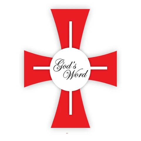
In 1992 the society of St Paul adopted a new logo as one single sign for all the activities of the Congregation from books to audiovisuals. The new logo is for Congregation’s world-wide use, valid in all countries where the Society operates 27 countries at present. The new logo is meant to be an effective means to project a better and more united image of the Society of St Paul before an ever growing and differentiating public. This logo represents our Institute and our apostolic activities, uniting them under a single sign.
This new logo expresses the foundational charism of the Society of St Paul to bring the Good News of Jesus to all people of all places and cultures. It symbolizes the dynamic mission of the members of the Society to move horizontally among the people and vertically in relation to God and the Word to be communicated.
In the logo the two dimensions of the mission of the Society of St Paul intersect:
1. To serve the Word of God in the world
2. To help the world rediscover the truths in the events and experiences of life.
Though seeking to remain above passing fashions, the new logo is a modern symbol emphasizing the role of the Society of St Paul in bringing the Good News to the people of today through the modern means ofthe Mass media.
Explanation of the Logo
In the two black lines, the descending one and the ascending one, one can perceive the salvific movement of the Word pronounced by God according to the prophet:
“My word is like the snow and the rain that come down from the sky to water the earth. They make the crops grow and provide seed for sowing and food to eat. So also will be the word that I speak - it will not fail to do what I plan for it; it will do everything I send it to do”
(Isaiah 55:10-11)
This dynamism is practically a going and coming of the human race by the Word which becomes the way identified with Christ: “The Way, the Truth and the Life” (Jn 14:6). One should not forget the extremely stylistic allusion to the double-edged sword of St Paul (Heb 4: 12). It expresses the penetrating power of the Word, capable of distinguishing the true from the false, the just from the unjust, the good from the bad, the beautiful from the ugly.
In the logo the allusion to the transcendent Word of God is interpreted horizontally by the spiral which to a discerning eye appears like P, the first letter of ‘Paul’, which is the key word of our institutional and apostolic identity. Besides, the spiral expresses in its revolving style the fundamental prerogative of our mission, the universalism which characterizes the cosmic vocation of our apostolate. This universalism is an essential evangelical criterion, as much in the choice of our target audience all human beings as in the choice of the content of our apostolate. These dimensions are integrated in an organic salvific project in the space and the time of every generation.
It is the Pauline charism whose origin consists in belonging to a community, which lives in fraternity and charity in the service of the Word of God and helping fellow humans to discover God in the signs of the times and in the daily experiences.


